I've been wanting to try hill climbing a UI with coding agents for a while, and in early November I finally let it run on one of my own apps for two days. Two model reviewers scored the app every round, and agents built whatever the reviews asked for. This post goes through how I set it up, what I changed along the way and what the scores actually told me. It's not meant as a "this is how you should do it" type of thing, more as notes from one fairly expensive experiment.
The short version
- It works, and pretty quickly. The first few rounds gave a real, measurable improvement.
- After that, the rounds kept making changes, but they were too small to move the score anymore. When a climb flattens out like that, I think you need to change how you climb: bigger changes and more risk, to look for a higher peak, if there even is one.
- The reviewers could read their own earlier reports for most of the run, and that inflated the scores quite a bit. Make them blind from the start.
- More agents didn't mean more output. Splitting the work so that each file had one owner did.
- Three designers agreed that the new version was better, but by less than the scores said, and they ranked round 10 above the final build. Their biggest complaint was how the app fits together, which no single screen score can catch.
- For me, the sweet spot was somewhere around rounds 4 to 10, which cost about $230 to $540 at list price. The whole run was about $1,540.
Background
The idea isn't new. Andrej Karpathy's autoresearch has agents run experiments and keep what works, and Poteto described the general version on Matt Pocock's channel as "some kind of rubric or a way to judge or score something", and then "have an agent continually try to make improvements". What finally got me to try it was Theo's video Agents Sucked At UI (Until Today). I started the day after it came out, without much of a plan.
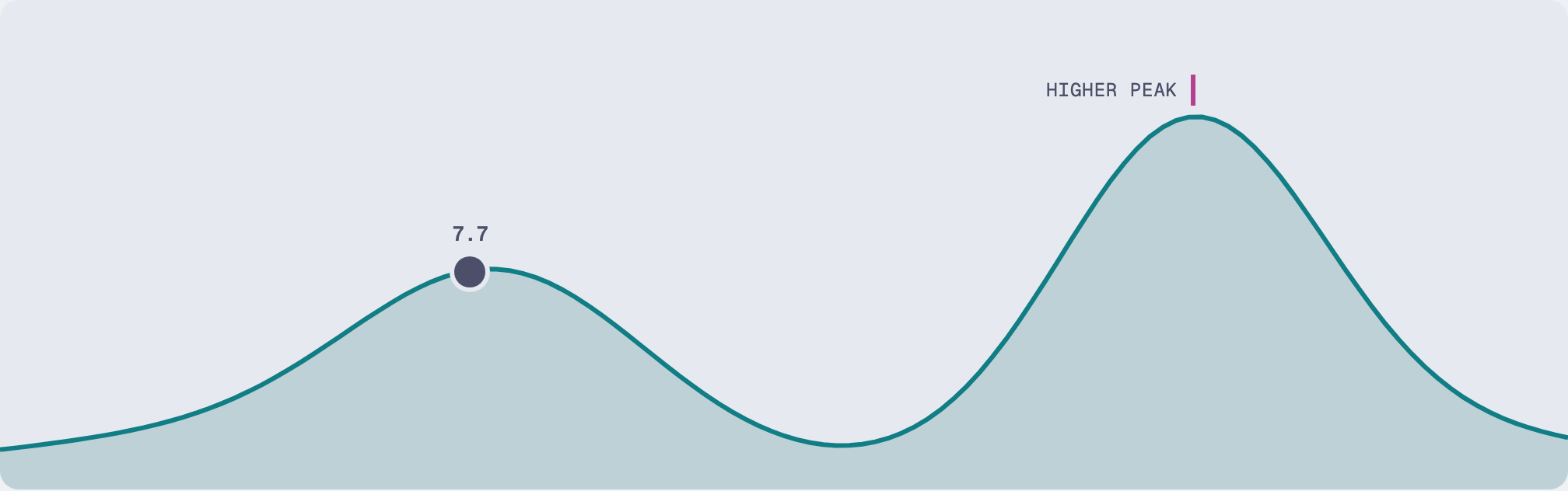
Hill climbing itself is a pretty simple loop. The agent can only see what's near it, so it makes a change, measures it, and keeps the change if the score goes up. It stops when no step nearby is higher, and it has no way of knowing whether that's actually the top of anything.
The catch is that you can end up on the nearest peak instead of the highest one.
This is where I think agents are a really good fit. They don't get tired or bored, so they keep trying steps long after a person would have stopped. And if you guide them to, they can take bigger and riskier steps as the climb goes on, which is how you get off a lower peak. Say you want a test suite to run faster: an agent can try a wild idea, measure it and throw it away if it didn't help, again and again, without anyone watching. Given enough time, something that concrete can be pushed pretty much as far as it goes.
Some things are much easier to climb than others. With tests, evals or latency, a program gives you the score, and that number doesn't really move unless the code does. A UI doesn't have anything like that, and no rubric really covers everything about it, so a model has to give the score, and model scores move around. In Theo's run a rival product's score went from 8.3 to 9.1 on screenshots nobody had changed, and as he puts it, if you give the same screenshot to the same model three times, you get three different scores. That noise ended up shaping pretty much everything in this run.
Theo's own run got to a 9 in about an hour and a half, and a 10 after around 18 hours and $250 to $400, so the last steps get expensive pretty quickly. One thing I took from his video directly was to hide the target score from the reviewers.
The setup
The target was the user research tool I've been building with agents. A researcher sets up tasks, a participant tries a prototype, and the session records the screen, voice and a transcript. I think it was a fair target, since it's a real app in daily use and it has a fixed visual style, so the agents couldn't just win by restyling everything.
My first prompt asked for roughly four things:
- Put every round through a council of reviewers.
- Stop when every member scores it at least 9.5. (This one sentence ended up costing a lot of money.)
- Don't tell the members what the target is.
- Score higher than the rival products, consistently, in every ranking.
Every PR also had to show what changed, with pins on before and after screenshots.
Before any code was written, one agent built a benchmark from screenshots of rival products: 16 references across six products, each mapped to the part of the app it should beat. It came with fair warnings too: some images were clearly staged marketing, and still images can't show interaction.
The council had two members, Opus 5.5 and GPT-6.1 Sol, both on extra high reasoning and read-only. Their brief made each of them a strict principal product designer, and they did walkthroughs on the running app, so they were judging behavior and not just pictures. Each filled in the same score sheet:
| Part of the app | Scores |
|---|---|
| Capturing observationsvs Frame.io | 5.5 / 8.8The app 5.5, Frame.io 8.8 |
| Reading a sessionvs Sentry | 6.0 / 8.3The app 6, Sentry 8.3 |
| Sessions listvs Sentry | 7.6 / 7.7The app 7.6, Sentry 7.7 |
| Findings triagevs Linear | 6.6 / 8.9The app 6.6, Linear 8.9 |
| Task resultsvs Maze | 5.7 / 8.4The app 5.7, Maze 8.4 |
| Evidence and transcriptvs Condens | 6.5 / 8.4The app 6.5, Condens 8.4 |
| Searchvs Condens | 6.9 / 7.8The app 6.9, Condens 7.8 |
| Shell and navigationvs Linear | 6.9 / 9.0The app 6.9, Linear 9 |
| SetupNo rival | 7.3The app 7.3, no rival |
Opus summed up the first round with "Competent, honest and clean, but slow at the things a researcher does for hours." Then the loop started:
- 1CouncilOpus 5.5 and GPT-6.1 SolEach reviews the running app on its own and writes a report: a score per row and up to 15 ranked changes.
- 2BriefOrchestratorMerges the two reports into one list. It never touches the UI code.
- 3BuildAgentsBuild the items, each agent in its own worktree, one commit per item.
- 4LandCIThe PRs merge, the checks run and the next council starts.
The reviews were better than I expected. In the first round Opus found an actual bug during its walkthrough, where a search hit showed the wrong time compared to the timeline. The early asks were mostly structural and the later ones got small and specific. Sol was the more literal one, at times measuring pixels ("the pin was around x420 while the writing field...").
Pins on every PR
With around 190 PRs in two days, I wasn't going to read every diff, so every PR had to show me what changed. The agents took their own screenshots and screen recordings with the built-in browser in T3 Code, at laptop and phone sizes. Then they put the before and after side by side, with numbered pins next to each change and a legend explaining each pin.
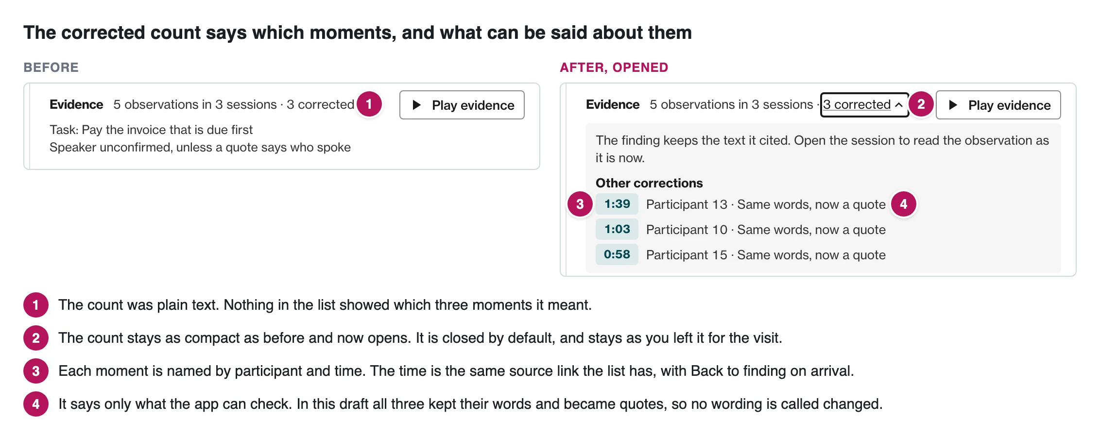
One of the agents wrote a small Playwright script for this. It takes the screenshots, the crops, the pin positions and the notes, lays them out as an HTML page and screenshots that into one image. The images were attached to the PR with the gh CLI and never committed. The brief had two rules for the pins: put them beside the thing they mark, never on top of text, and look at each finished image before attaching it. Over the whole run, the PRs ended up with 1,274 pins.
Fewer agents, more PRs
I didn't plan any of the rules I ended up changing. Most of them came from reading through a thread and getting annoyed at what was happening.
The biggest one was parallelism. My first prompt said something like "if you want, you can parallelize", and the orchestrator happily did, with one agent per item. Building got about three times faster, but joining the work back together ate most of that.
The reason was the shape of the code. The agents kept editing the same files, so I switched to lanes, where each agent owns a set of files and takes several items.
One agent per item
10 agents, 10 PRs, about 55 minutes
Ten agents each take one item. Four of them edit the session page and two share another file, so their PRs collide when they merge.
Lanes with one owner per file
4 agents, 16 PRs, 39 minutes
Four agents each own a set of files and take several items. No two agents edit the same file, so the PRs merge cleanly.
So the shape of the codebase set the limit, not how many agents I threw at it.
Other things I changed
The checks were also in the way for a while. The verify script ran everything in series, about 20 minutes, and the council waited for it. Moving to a parallel CI run on a separate instance got that down to around 8 to 10 minutes. Rounds didn't actually get shorter though, since the orchestrator just picked bigger items to fill the time. That's fine, but I wouldn't call it a speedup.
Images were the other limit. The reviewers take a lot of screenshots on their walkthroughs, and when Sol ran through OpenCode or Foundry, it hit a limit of 50 images. Codex with the OpenAI subscription never did. Sol didn't run through the same route every round, so that adds a bit of noise to its scores.
The results
The app does look better, and everyone who has seen it seems to agree. The numbers are the more interesting part though.
- Round 4 Over 8 in three rounds
- Round 18 9.22 and 9.06, the goal looks reachable
- Round 19 Blind: 8.64 and 8.65
| Round | Opus 5.5 | GPT-6.1 Sol |
|---|---|---|
| 1 | 6.42 | 6.392 |
| 2 | 7.605 | 7.883 |
| 3 | 7.755 | 8.254 |
| 4 | 8.135 | 8.327 |
| 5 | 8.025 | 8.573 |
| 6 | 8.28 | 8.091 |
| 7 | 8.515 | 8.424 |
| 8 | 8.445 | 8.414 |
| 9 | 8.205 | 8.547 |
| 10 | 8.54 | 8.669 |
| 11 | 8.64 | 8.737 |
| 12 | 8.77 | 8.563 |
| 13 | 8.9 | 8.782 |
| 14 | 9.005 | 8.863 |
| 15 | 9.045 | 8.951 |
| 16 | 9.105 | 9.007 |
| 17 | 9.15 | 8.985 |
| 18 | 9.22 | 9.063 |
| 19 | 8.64 | 8.65 |
| 20 | 8.695 | 8.687 |
| 21 | 8.69 | 8.665 |
| 22 | 8.665 | 8.702 |
Around round 18 I noticed that the reviewers could read the earlier rounds, including their own scores. So from round 19 I told them not to open any earlier report. Every row dropped at the same time, and a whole app doesn't get worse overnight, so that was the scoring changing, not the app. If you run a council like this, assume it can see its earlier scores unless you've blocked it.
To get a number I could trust, the last round scored the old version and the final build side by side, blind, and the final build twice to see how much the score moves on its own.
| Measure | Points |
|---|---|
| Opus 5.5 | |
| Score chart, round 1 to 18 | +2.80 |
| Blind, old next to final | +1.87 |
| Same build, scored twice | 0.09 |
| GPT-6.1 Sol | |
| Score chart, round 1 to 18 | +2.67 |
| Blind, old next to final | +0.94 |
| Same build, scored twice | 0.12 |
The designer study
The model scores are useful, but I don't think they're enough on their own, so I wanted real people to check the result too. Three designers at Zure did the same five tasks in both the old and the new version. Then they compared screenshots without knowing which version was which: old against new for 12 screens, and four versions of six screens ranked from best to worst.
Rating out of 10
| Designer | Old build | New build |
|---|---|---|
| P1 | Old build 3, new build 7 | |
| P2new first | Old build 4, new build 4 | |
| P3 | Old build 5, new build 8 | |
Tasks completed
Five tasks each, all three designers
- Old build
- 6 of 15
- New build
- 10 of 15
Round 10 against the final build
Six screens, four versions each, ranked by three designers
Round 10 ranked higher in 13 of 18
The direction matched the council. Two of the three rated the new version clearly higher, more tasks got done in it, and 10 of the 12 screen pairs leaned towards the new one. The size didn't match though. On a scale from −2 to +2, the average vote was +0.47, about halfway between "no difference" and "slightly better". And round 10 ranked above the final build in 13 of 18 rankings, so the rounds after it probably didn't make things better, at least not in a way people could see. One result doesn't depend on the order: finding where a run went wrong worked for all three in the new version and for one in the old, since the drill-down only exists in the new one. They also liked the replay, with its cursor, timeline and success markers, and one of them called the transcript really, really good.
What the council missed was mostly structure, not single screens. The designers couldn't tell where they were, how to get back, or how recordings, participants, observations and findings connect to each other. One of them described it as features laid out from a list and left to spread until they touched, with no user journey connecting them. A few more specific things came up too:
- Nobody managed to capture a moment from a recording in either version. That one is a real problem, since it's pretty much the core job of the app, and that part of the UX clearly needs work.
- Buttons with keyboard shortcut chips act on the first click, so people didn't dare press them. They wanted to choose first and then confirm.
- The designers said the charts had no legends, so they couldn't tell a good result from a bad one. I don't fully agree with that one. The legends are there, but they're clearly not visible enough or distinct enough from the rest of the page, and the study didn't leave much time to take the information in.
I think all of this points to the app needing a better overall story of the research process, one that the UI tells as you go. At the same time, that's the kind of thing people would probably learn after using the app once, and a single session can't show that.
I do think the setup skewed the results against the app. The designers hadn't used it before, and I dropped them into the middle of a project full of data, without any introduction to the app itself. One of them had earlier tried an older version from the very start, entering their own test data, and back then wanted to use it in a real project right away. This time it felt a lot more confusing, even though the new version was clearly the better of the two. The designer who used the new version first saw no difference at all, so the order probably mattered too. With three people, I read this as a direction, not proof.
Was it worth it?
At list price, the whole run came to about $1,540. Subscriptions and Copilot's flat rate covered most of it, but the Foundry part was real money.
| Part | List price |
|---|---|
| Implementation (Claude) | $1,134 |
| Council | $215 |
| Orchestrator | $138 |
| Review | $53 |
Almost all of the input tokens were cache reads, so without prompt caching this would have looked very different.
Most of the improvement came early:
Round 4: $227 spent, mean score 8.23
| Round | Spend | Mean score |
|---|---|---|
| 1 | 11 | 6.41 |
| 2 | 87 | 7.74 |
| 3 | 150 | 8.00 |
| 4 | 227 | 8.23 |
| 5 | 287 | 8.30 |
| 6 | 336 | 8.19 |
| 7 | 391 | 8.47 |
| 8 | 433 | 8.43 |
| 9 | 481 | 8.38 |
| 10 | 539 | 8.60 |
| 11 | 603 | 8.69 |
| 12 | 659 | 8.67 |
| 13 | 711 | 8.84 |
| 14 | 758 | 8.93 |
| 15 | 797 | 9.00 |
| 16 | 851 | 9.06 |
| 17 | 930 | 9.07 |
| 18 | 1012 | 9.14 |
| 19 | 1078 | 8.64 |
| 20 | 1158 | 8.69 |
| 21 | 1226 | 8.68 |
| 22 | 1298 | 8.68 |
After round 10 the line keeps going up, but the blind rounds sit at 8.67 on later and better builds, so anything above that level probably wasn't real. The designers ranking round 10 above the final build points the same way. That's why I'd put the sweet spot at around rounds 4 to 10. Stopping there would have missed some real fixes the scores couldn't see though, like removing a five-second stall and a bug where a written note could get lost. So the later rounds were worth it for the fixes, not for the polish.
Where it got stuck
The run ended at 8.68, and the goal needed another 0.82. At the rate the blind rounds were going, that would have been something like 80 more rounds and $5,800, with a pretty small chance of ever getting there. If the reviewers can't reliably confirm the goal, the loop never stops, it just keeps spending money. Theo got to 10 with a council that could see its own history. I got to 8.9 with one that couldn't, and I suspect that explains a lot of the difference.
- A local peakThe rules fenced the climb: a fixed look, one search box, the Reader as an opt-in.
- NoiseScoring the same build twice can give results 0.1 apart, and each blind round added only about 0.01. Progress that small is too small to see.
- The top of the scaleA strict, blind reviewer may not go much higher for any real product.
I can think of three reasons the scores stopped going up, and more rounds of the same loop won't tell them apart:
- A local peak. My own rules limited what the agents could change. In one round Opus said about one of them: "That's the price of the ruling, and I have no design that beats it." I did try a round of bigger changes, but it doesn't show in the scores.
- Noise. Scoring the same build twice can give results 0.1 apart, and each blind round added only about 0.01. The app could still be improving, just by too little for the scores to show.
- The top of the scale. The brief calls 10 reference-quality work, and the best rival scored 9.0. A strict, blind reviewer may not go much higher for any real product.
For me this was the most interesting part: the scores show that the climb flattened out, but not why. The designer study adds one more thing: the reviewers scored the app screen by screen, and the biggest problems the designers found were in how the screens connect. A loop that scores screens can't climb towards that.
The brief also said "Prefer removing things", and that didn't really happen. The agents added about 17,000 lines to the web app and removed about 4,000. I think score loops naturally reward adding things: a missing feature is easy to spot, and an unneeded one isn't. The designers noticed it too. Asked what was overbuilt, one of them answered "The whole application".
Final thoughts
I'll be doing this again, and next time I'll change a few things:
- Make the council blind from round 1, and freeze the rival scores in the first round.
- Score the same build twice before starting, to know how noisy the scores are.
- Use lanes with file owners from the start instead of one agent per item.
- Set a stop rule up front, based on the slope and not a target number. Something like three flat rounds.
- Give the agents a design system with layout rules before the first round, and tell them to ask instead of inventing when something is missing. Otherwise you get the average of every reference on the internet, and fixing the basics late is harder, because you first have to undo what's been built.
- Put people at both ends: a researcher walking through their real work before round 1, and a study at the end. When people check the result, give them a proper introduction to the app first, and switch the order of the versions between people.
The change I'm most interested in is what goes into the loop. This climb started from screenshots of rival products, and the council's score sheet was written by an agent. Now I have real feedback: the study found around ten specific failures, most of them with recordings behind them. That feedback could become both the council's brief and its score sheet, with rows like "can a first-time user capture a moment" or "can you always tell where you are". The loop itself would stay as automated as before, with no people inside it, and the study at the end stays as the check. My bet is that it would take a few rounds instead of 23, because it would be climbing the right hill. One of the designers said much the same thing: one round of design critique gives the big jump, and a loop built on precise user feedback could give much more interesting results. I haven't run that yet though.
I'll also think more about what to climb in the first place. Anything a program can score is a lot cheaper and less noisy: load time, bundle size, latency, accessibility violations, flaky tests, or an eval for your own agent or MCP server. Somewhere in between are tasks an agent can try as a user, like setting something up in the app and counting whether it finishes and how many steps it takes, or seeing how often an agent finds answers from your docs. Removing code is another option, with the UI score and the study's tasks as a floor instead of a target, so that nothing people could already do breaks. I'm not convinced it's the most valuable thing to climb though, since fewer lines isn't really a goal in itself.
So yes, it works. It costs a bit, but it's a good way to get a lot of improvement quickly, as long as you measure the noise first, keep the reviewers blind and decide when to stop before you start. And I'd start from what real people struggle with, not from what a model thinks good looks like. After that, it's mostly about knowing when to try something different.
Comments